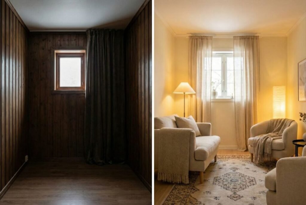
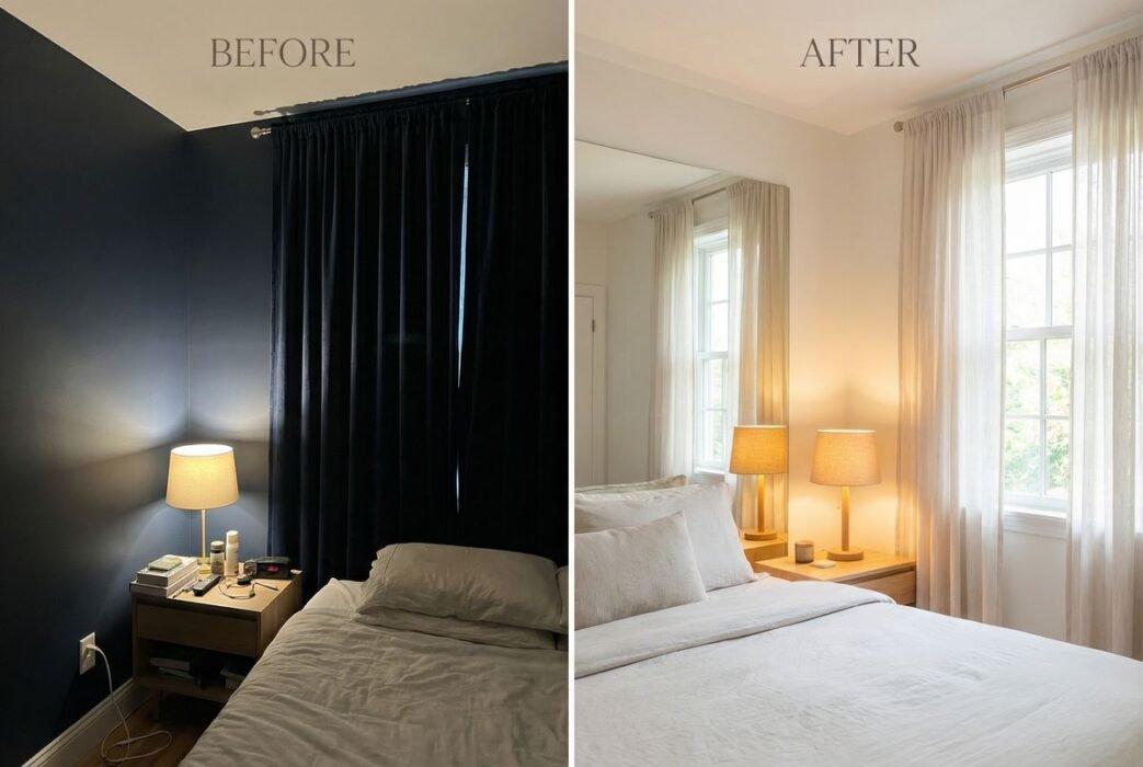
Are you struggling with a small, dark room that feels cramped and uninviting? Choosing the right paint color can dramatically transform such a space, making it appear brighter, more spacious, and infinitely more appealing. This guide will explore the best paint colors for small dark rooms, offering expert insights and practical advice to help you revitalize your home.
Understanding the Challenge of Small, Dark Rooms
Small rooms often lack natural light, which can make them feel enclosed and gloomy. According to HCM Property Management, the key to successful paint selection in these spaces is to counteract these limitations by maximizing perceived light and openness. It’s not just about choosing a light color; it’s about understanding how different hues interact with available light and room dimensions.
The Science Behind Light and Color
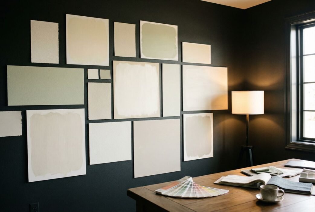
Paint colors have varying light reflectance values (LRV), which indicate how much light a color reflects. Higher LRV colors reflect more light, making a room feel brighter. However, it’s also crucial to consider the undertones and saturation of a color, as these elements significantly influence the overall ambiance.
Top Paint Colors to Brighten Small Dark Rooms
Here are some of the most effective paint colors to consider for your small, dark spaces, along with their unique benefits.
1. Crisp Whites and Off-Whites
Whites are the quintessential choice for brightening any room. They reflect the maximum amount of light, instantly making a space feel larger and more open. However, not all whites are created equal. For dark rooms, avoid stark, cool whites that can feel sterile. Instead, opt for whites with warm undertones, such as a hint of yellow, beige, or gray.
- Benefits: Maximizes light reflection, creates a clean canvas, versatile.
- Considerations: Can feel cold if the wrong undertone is chosen; requires careful pairing with other decor elements.
2. Pale Grays
Light gray shades offer a sophisticated alternative to white. They provide a subtle depth while still reflecting ample light. Look for grays with blue or green undertones to evoke a sense of calm and spaciousness, or warm grays for a cozier feel.
- Benefits: Modern, versatile, adds subtle character without overwhelming the space.
- Considerations: Can appear dull if too dark or if the room lacks complementary colors.
3. Soft Blues and Greens
Cool colors like pale blues and greens are known for their calming and expansive qualities. They can mimic the sky or natural landscapes, creating an illusion of openness. These colors work particularly well in rooms where you want to foster a serene atmosphere.
- Benefits: Creates a tranquil, airy feel; visually expands the room.
- Considerations: Can feel too cool if not balanced with warm accents.
4. Light Yellows and Creams
For a touch of warmth and cheer, light yellows and creams are excellent choices. They bring a sunny disposition into a dark room, making it feel more inviting and less oppressive. These colors are particularly effective in north-facing rooms that receive less direct sunlight.
- Benefits: Adds warmth and cheerfulness, brightens without feeling stark.
- Considerations: Can appear too vibrant if the saturation is too high; choose muted tones.
The Golden Ratio: Balancing Light and Color
Achieving the perfect balance in a small, dark room involves more than just paint. Consider the “golden ratio” of design elements:
| Element | Contribution to Brightness/Space | Recommendation for Small Dark Rooms |
|---|---|---|
| Paint Color | Reflects light, sets mood | High LRV, cool or warm undertones |
| Lighting | Direct illumination, ambiance | Layered lighting (ambient, task, accent) |
| Mirrors | Reflects light, creates illusion of depth | Large mirrors strategically placed |
| Furniture | Visual weight, obstruction | Light-colored, leggy, multi-functional pieces |
| Decor | Adds personality, texture | Minimalist, reflective surfaces, natural elements |
Unique Strategies for Maximizing Light
Beyond traditional paint choices, consider these innovative approaches to further enhance your small, dark room.
Myth Busting: Dark Colors are Always Bad
While light colors are generally recommended, a bold, dark color can sometimes work in a small room if used strategically. For instance, painting one accent wall in a deep navy or charcoal can create depth and drama, making the other walls appear to recede. This technique requires careful consideration of lighting and complementary decor.
Expert Perspective: The Power of Sheen
“The sheen of your paint can be just as important as the color itself,” says interior designer, Sarah Jenkins. “Higher sheens, like satin or semi-gloss, reflect more light than matte finishes. While matte is popular for its sophisticated look, a subtle sheen can significantly boost brightness in a dark space without being overly reflective.”
Conclusion: Illuminating Your Small Dark Room
Transforming a small, dark room into a bright and inviting sanctuary is entirely achievable with the right approach to paint colors. By understanding the interplay of light, color, and strategic design elements, you can create a space that feels larger, more open, and truly reflects your style. Experiment with these best paint colors for small dark rooms and enjoy the remarkable transformation.
Frequently Asked Questions
Q: Should I use a primer before painting a dark room with a light color?
A: Yes, using a high-quality primer, especially a white or light-colored one, is highly recommended. It helps to cover the existing dark color, ensures better adhesion of the new paint, and provides a more uniform and brighter base for your chosen light hue.
Q: Can I use wallpaper in a small dark room?
A: While paint is often preferred for its light-reflecting qualities, you can use wallpaper in a small dark room. Opt for wallpapers with light backgrounds, subtle patterns, or metallic accents that can reflect light. Avoid busy, dark patterns that can make the room feel even smaller and more enclosed.
Q: How does natural light direction affect paint color choice?
A: Natural light direction significantly impacts how a paint color appears. North-facing rooms receive cooler, indirect light, making warm colors (like light yellows or creams) a good choice to counteract the coolness. South-facing rooms get abundant warm light, so cooler tones (like pale blues or grays) can help balance the warmth. East-facing rooms get morning light, and west-facing rooms get afternoon light, both of which change throughout the day, requiring a balanced approach.
