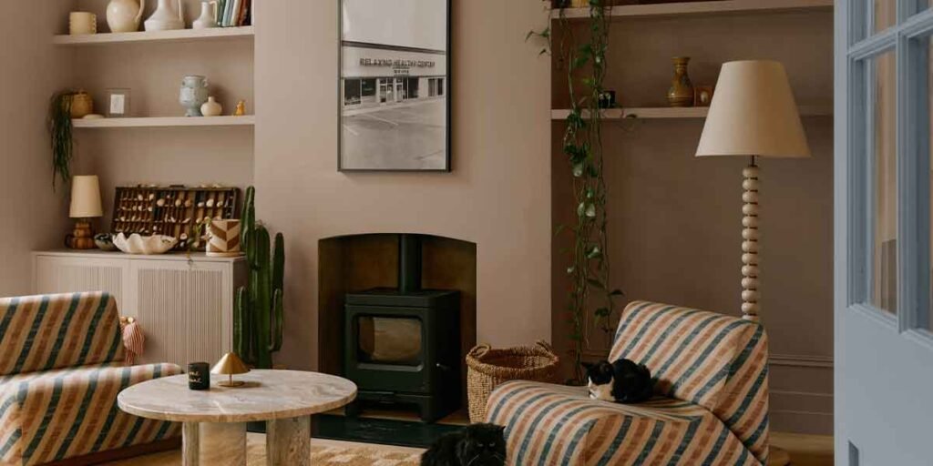
Match the paint to the light a living room actually gets, and the best paint colors for living rooms reduce to a shortlist of two or three.
Sun direction, window size, floor tone, and the bulbs that come on after dark change how any color behaves on a wall. A white that looks crisp on a display rack can read gray in a room facing north, and a warm gray that photographs beautifully can go flat under a cool white LED.
Skipping a step in that order is what sends people back to the paint counter.
What the Light Decides Before Anything Else
A living room’s compass direction, window size, floor tone, and evening bulbs narrow the choice more than any trend list does. Rooms that face north and rooms that lean on lamps need warmer, lighter paint to keep from reading gray, while a room with south-facing glass can carry a deeper tone without going flat.
Behr’s lighting guidance sorts household bulbs into three bands, soft white from 2000K to 3000K, true white from 3100K to 4500K, and daylight from 4600K to 6500K, and publishes worked examples for each direction of drift. A warm beige shifts toward peach under a 2700K lamp, holds a balanced middle at 3500K, and sheds most of its warmth at 5000K. A cooler shade moves the other way, picking up a yellow cast under 2700K and turning visibly bluer under daylight bulbs.
A chip inspected in a store aisle tells you very little, since the store’s bulbs run at a color temperature no room in a home uses.
Paint two coats onto a piece of poster board or a scrap of drywall and carry it around the room for two days, checking it in morning light, in late afternoon, and after sunset with the lamps on. Painting the sample straight onto the wall is the shortcut that fools people, because the old color sits right beside the new one and shifts what the eye reports.
I once painted a north-facing living room in a white I had only seen under store lighting. On the wall it read as wet concrete, and the leftover gallon ended up on a shed door.
What the Number on the Chip Back Can and Cannot Tell You
Light reflectance value runs from 0, a surface that absorbs all light, to 100, one that reflects all of it, and Sherwin-Williams prints that number on the back of every color chip. Sherwin-Williams advises an LRV of 60 or higher for north-facing or low-light rooms, and places a crisp, airy neutral between 50 and 60.
Three shades that turn up on living room shortlists sit far apart on that scale. Sherwin-Williams lists Pure White (SW 7005) at about 84, Silver Strand (SW 7057) at about 59, and Amazing Gray (SW 7044) at about 47. The distance between 84 and 47 separates a wall that dissolves into the light from one that reads mid-tone at noon.
Shortlists of the best paint colors for living rooms group shades by mood, which is a sensible way to browse and a poor way to decide. The reflectance figure answers whether a color can hold a room at that room’s light level before style enters the conversation.
The figure also says nothing about undertone, the second number in the decision and the one no chip prints. Two grays with the same LRV can lean warm and green or cool and violet, and the leaning is what a floor, a wood table, or a stone fireplace either supports or fights.
Farmhouse palettes and the undertone trap
Farmhouse interiors are built from warm whites, creamy beiges, soft greens, muted blues, and earthy browns, and Behr’s own modern farmhouse guidance describes that mix while steering away from cool grays. Behr names Blank Canvas (DC-003) and Winter White (DC-004) as exterior whites chosen for softness, and its farmhouse color list puts Polar Bear 75 and Swiss Coffee 12 on trim and doors, Antique White 23 on walls, and greens such as Greenwich Village (N440-3) or Muted Sage (N350-5) on cabinetry.
Sherwin-Williams assembles the same style around pale neutrals with dark contrast: Pure White (SW 7005), Shoji White (SW 7042), and Sandstone (SW 7547) on light surfaces, Iron Ore (SW 7069) or Caviar (SW 6990) as the contrast, and Still Water (SW 6223) or North Star (SW 6246) for accents.
Undertone is where farmhouse palettes fail. A trim white with a green cast set against a greige with a violet cast looks dirty at the corner where they meet, and the problem shows up worst at night, when there is less light to soften it. The comparison costs nothing: put the trim white and the wall greige on one board and study that seam under the lamps.
Sheen Decides How a Living Room Wall Wears
Sherwin-Williams orders interior sheens by how much light they reflect: gloss first, then semigloss, then satin, eggshell, or low-lustre, then flat or matte. Higher sheen cleans up better and exposes every drywall flaw; flat hides the flaws and holds onto marks.
For a living room the usable range is narrow. Walls take matte or eggshell in most homes, satin where hands and traffic are constant, and semi-gloss or gloss belongs on trim, casings, and built-ins; a large field of wall rarely rewards it.
| Sheen | Where it fits in a living room | The trade-off |
|---|---|---|
| Flat or matte | Large walls with imperfect drywall, ceilings, low-traffic sitting areas | Hides surface flaws; Sherwin-Williams notes stains are often difficult to remove from flat finishes and that scrubbing can burnish the film |
| Eggshell or low-lustre | General wall paint in most living rooms | Middle ground on cleanup, with a slight sheen at an angle |
| Satin | Family rooms, walls beside a busy doorway or a wood stove | Easier to wash than eggshell; reflections become more visible |
| Semi-gloss | Baseboards, door casings, window trim, built-ins | Wipes clean easily; used wall-wide it exposes every ding |
| High gloss | Doors, furniture, one accent panel chosen on purpose | Benjamin Moore calls it the most durable and easiest to clean of its finishes; a mirror-like wall is a committed look |
Whether a mark wipes off depends on the film a product builds, and two cans labeled matte can build very different films.
The two largest American paint makers do not describe matte the same way. Sherwin-Williams warns that flat finishes hold stains and burnish when rubbed. Benjamin Moore says its matte stands up to frequent washing, listing it for hallways and family rooms. Formulation accounts for much of that split. A cross-linked matte product cleans more like a hard finish, while a builder-grade flat does not, and Sherwin-Williams markets its Duration Home line, sold in matte, satin, and semigloss, on a cross-linking technology the company says delivers better washability than competing matte paints.
When Living Room Paint Work Leaves DIY Behind
Paint work in a home built before 1978 falls under federal rules that few homeowners expect to meet. Disturbing more than six square feet of painted surface per interior room, or more than 20 square feet outside, brings the job under the EPA’s Renovation, Repair and Painting rule, in force since April 22, 2010.
The exemption at the edge of that line is the one homeowners misread. Minor repair and maintenance covers six square feet or less of disturbed paint per interior room, counted within a 30-day period, so two small patches in the same room on separate weekends add together. Window replacement and demolition of painted surfaces are covered no matter how small the area. Open-flame burning, heat guns run above 1,100 degrees Fahrenheit, and high-speed grinding without HEPA-filtered exhaust are prohibited outright.
Once a job is covered, the contractor side changes. Anyone paid to disturb paint in pre-1978 housing or a child-occupied facility has to be certified in lead-safe work practices, a category that reaches sole proprietorships, and a certified renovator has to direct the work. The certification requirement covers work done for pay, so a homeowner repainting a residence they own is not the party the rule regulates, and a certified inspector or risk assessor can still settle what is on the wall with a lead determination.
Four conditions should stop the work and hand it to someone licensed for it. Painted surfaces that chalk, peel, or flake in a pre-1978 home need that lead determination first. Bubbling or blistering paint points to moisture behind the wall, and a fresh coat over wet substrate fails again. Vaulted or two-story living rooms put the work past the safe reach of a homeowner on a stepladder. Walls that have to be opened, or outlets and switches that have to move, belong to an electrician even when paint is the reason for the opening.
A home finished in 1978 or later, and any surface a certified inspector or risk assessor has declared lead-free, falls outside the rule. Get that determination in writing before scraping begins, because it decides who is allowed to do the work.
Some states run their own lead-safe renovation programs in place of the federal rule, so a licensed firm or the state lead office is the place to confirm what covers a specific address.
Living Room Paint Colors: Frequently Asked Questions
What is the most popular color to paint a living room?
No audited national ranking of living room colors exists. What manufacturers publish is sales data, which answers a different question from what fits one wall. Behr names Polar Bear 75 and Swiss Coffee 12 as its top-selling whites, describing the first as a milky, bright neutral for walls and trim and the second as a softer white with a greige undertone. Both sit high on the reflectance scale, which is part of why they survive in rooms that lack light.
What are the top 10 colors for a living room?
No manufacturer or agency maintains a top ten for living rooms, and a list assembled for someone else’s light does not transfer. Two filters do the work a ranking cannot: a reflectance floor that matches the room’s light, and an undertone comparison against the floor and the bulbs in use. A ten-shade shortlist of the best paint colors for living rooms is worth keeping only after those two passes cut it to two or three.
What color looks best in a living room?
The shade whose undertone still reads clean under the light the room actually has. That often means a warmer white or greige in a north-facing space and a cooler or deeper tone where the windows face south. A color that looks right at noon and muddy at nine in the evening was the wrong color for that wall.
What are the trendy colors for living rooms in 2026?
Trend lists carry no authority, and the closest thing to a published answer is the palette a manufacturer is actively promoting. Behr’s modern farmhouse guidance keeps warm whites, creamy beiges, soft greens, and earthy browns in front, while Sherwin-Williams pairs pale neutrals with Iron Ore or Caviar as contrast. Both serve as a cross-check on whatever a paint counter is pushing this season.
Buy the sample before the gallon and give it two evenings under the lamps. In a home built before 1978, settle what is on the wall first, because that answer decides who is allowed to hold the scraper.
