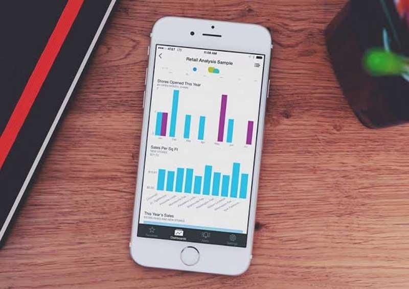
A report that looks great on a desktop can become difficult to use on a phone. Charts shrink, labels become harder to read, and users may spend more time scrolling than checking their data.
That is why mobile reporting needs its own design approach. The goal is not to squeeze the desktop report onto a smaller screen. You need to decide what mobile users actually need and build the experience around those priorities.
This guide explains how to design a Power BI mobile dashboard for smaller screens. We will cover layouts, visuals, navigation, filters, testing, and common design mistakes.
Why a Power BI Dashboard Needs a Different Mobile Layout
A Power BI dashboard may contain several visuals that work perfectly on a large monitor. On a phone, the same layout can quickly become crowded and difficult to navigate.
Mobile users also interact with reports differently. They tap instead of clicking, have less screen space, and often need information quickly. A good mobile layout accounts for these differences instead of simply shrinking the desktop version.
The most important information should appear early. Users should not need to scroll through several charts before reaching the KPI they opened the report to check.
What to Include in a Power BI Mobile Dashboard
Mobile screens force you to be more selective about what appears in the report. Start with information users are likely to need while they are away from their desks.
- Place important KPIs near the top of the mobile layout.
- Include only charts that support common mobile reporting tasks.
- Keep frequently checked targets and performance metrics easy to reach.
- Prioritize recent changes that may require user attention.
- Include filters only when users are likely to change them.
- Move detailed tables and supporting data further down the page.
- Remove visuals that provide little value on a smaller screen.
How to Create a Mobile Layout in Power BI
Power BI lets you create a mobile-specific layout instead of relying entirely on the desktop report. This gives you more control over which visuals appear and how users move through them.
Start With the Existing Report
You do not need to rebuild the entire report for mobile. Start with the visuals already available in the desktop version and identify the ones mobile users actually need. This keeps the underlying reporting logic consistent across both experiences.
Arrange Visuals for a Vertical Screen
Desktop reports often place several charts next to each other. Mobile layouts work better when important visuals follow a clear vertical order. Users can then move through the report naturally by scrolling down the screen.
Preview the Mobile Experience
A layout that looks clean inside the editor may feel different on an actual phone. Preview the report and check the size of text, buttons, labels, and interactive controls. Small adjustments can make a significant difference once the report is viewed on a smaller display.
Choosing the Right Visuals for Smaller Screens
Not every Power BI visual works equally well on a phone. Mobile reports need visuals that remain clear even when horizontal space is limited.
KPI cards are useful because they can communicate an important number without requiring much space. Line and bar charts can also work well when categories and labels are kept under control. Complex visuals may need more room than a mobile screen can provide.
Tables require more care because users may need to scroll horizontally to read them. If detailed records are necessary, keep the most important columns visible first. Consider moving deeper information into another page rather than showing everything at once.
The same principle applies to maps and highly detailed charts. They may look impressive on desktop but become difficult to read on a phone. Mobile design should favor clarity over the number of visuals displayed.
Best Practices for Power BI Mobile Dashboard Design
A mobile dashboard should make important information easy to find with minimal interaction. Simple design choices can reduce unnecessary scrolling and make reports much easier to use.
- Use a clear vertical flow instead of a wide desktop-style layout.
- Keep text and data labels large enough to read comfortably.
- Leave enough space around buttons and other interactive elements.
- Avoid placing too many KPI cards close together.
- Keep chart titles short and clear.
- Limit the number of categories displayed within small charts.
- Use consistent visual placement across related mobile report pages.
How to Handle Filters and Navigation on Mobile
Filters and navigation take up valuable space on a mobile report. They should remain easy to access without becoming more prominent than the information users came to view.
Keep Important Filters Easy to Reach
Users may still need to switch between dates, regions, departments, or other important fields. Keep these controls simple and avoid filling the top of the report with slicers. Dropdowns can help when several values need to fit into a smaller area.
Simplify Report Navigation
Moving between several report pages can become frustrating on a phone. Keep the number of navigation choices under control and use clear labels for each destination. Users should know where a button will take them before tapping it.
Reduce Unnecessary Interactions
Every extra tap adds friction to the mobile experience. Avoid making users open multiple menus simply to reach a common metric. Frequently used information should require as little interaction as possible.
Designing a Power BI Risk Management Dashboard for Mobile Users
A Power BI risk management dashboard can be especially useful on mobile when managers need quick access to incidents, risks, and pending actions. The mobile version should focus on information that may require attention rather than showing every detail available in the desktop report.
Start with high-priority risks and issues that need immediate review. Users may also need to see severity, current status, ownership, or overdue actions while they are away from their desks. Detailed supporting information can remain available deeper within the report.
Mobile filters can then help users narrow risks by location, category, status, or another useful field. Keep these controls limited to common reporting needs. Too many filtering options can quickly take over the available screen space.
Common Power BI Mobile Design Mistakes to Avoid
Mobile reporting problems often appear when the desktop experience is treated as the default. Before publishing, review the report specifically as a mobile user would experience it.
- Trying to fit every desktop visual into the mobile layout.
- Making users scroll too far before reaching important KPIs.
- Using text and labels that become difficult to read on phones.
- Showing large tables that require constant horizontal scrolling.
- Adding too many slicers and navigation controls to small screens.
- Using complex visuals that lose meaning when reduced in size.
- Publishing without testing the report on actual mobile devices.
Conclusion
A Power BI mobile dashboard should not simply be a smaller copy of the desktop report. Mobile users have less space and often need answers quickly, so the report needs stronger priorities.
Start with the metrics people are most likely to check while using their phones. Keep visuals clear, reduce unnecessary interactions, and build the page around a simple vertical flow.
Most importantly, test the finished report on smaller screens. A few thoughtful changes to layout, navigation, and filtering can make mobile reporting much easier to use.
